library(werptoolkitr)
library(ggplot2)
library(dplyr)
library(sf)Maps
Overview
This notebook provides examples of creating maps to display toolkit data and especially aggregated outcomes. Typically, these have quantitative fill that is spatially-relevant, whether that is a point (gauge) or polygon (SDL unit, basin, etc). The numerical values can be more difficult to ascertain precisely from maps, but they are often the clearest way to present spatial data, especially when the message is one of spatial variation. Because maps lose two dimensions for data, we often have to reduce the number of categories we look at and rely heavily on facetting.
As with all plots in {werptoolkitr}, maps have the ability to use color and different color palettes to include additional information, including type of response. These settings are dealt with more completely in the bar_plots, with much of the mechanics the same for maps and lines e.g. the use of colorgroups and a list for pal_list.
With maps, we can also plot multiple layers in the foreground overlay and background underlay, though at present these have fewer options than the ‘primary’ layer (e.g. we cannot plot data as fill in multiple polygon layers).
Demonstration setup
As usual, we need paths to the data.
project_dir <- file.path('more_scenarios')
hydro_dir = file.path(project_dir, 'hydrographs')
agg_dir <- file.path(project_dir, 'aggregator_output')
Scenario information
Get scenario metadata. This will be auto-found later, but leaving here until it firms up.
scenarios <- jsonlite::read_json(file.path(hydro_dir,
                                           'scenario_metadata.json')) |>
  tibble::as_tibble() |>
  tidyr::unnest(cols = everything())
Subset for easier demonstration
In many cases there are too many scenarios for clear examples, so we use the scenariofilter argument to reduce them to a subset. For this demonstration, we will use
scenario_subset <- c('down2', 'down1_25', 'base', 'up1_25', 'up2')Standard scenario appearance
We want to have a consistent look for the scenarios across the project, with a logical ordering and standard colors. In future, this will potentially be able to be parsed from metadata, but at present we will define these properties manually. They are not included in the {werptoolkitr} package because they are project/analysis- specific.
sceneorder <- forcats::fct_reorder(scenarios$scenario_name, scenarios$flow_multiplier)
scene_pal <- make_pal(unique(scenarios$scenario_name),
                      palette = 'ggsci::nrc_npg',
                      refvals = 'base', refcols = 'black')
Choosing example data
First, we read in the aggregated data. There is example data provided by the toolkit (agged_data and agged_data_colsequence), but to continue with the demonstration, we will use the aggregations created here in the interleaved aggregation notebook.
Note- to readRDS sf objects, we need to have sf loaded.
agged_data <- readRDS(file.path(agg_dir, 'summary_aggregated.rds'))As with line plots, we’ll make a grouping variable in the SDL-scale env_obj data for demonstrating grouped palettes, but will leave the other aggregation levels alone, and do any minor modifications there while piping into plot_outcomes.
# Create a grouping variable
obj_sdl_to_plot <- agged_data$sdl_units |>
  left_join(scenarios, by = c('scenario' = 'scenario_name')) |>
  dplyr::mutate(env_group = stringr::str_extract(env_obj, '^[A-Z]+')) |>
  dplyr::filter(!is.na(env_group)) |>
  dplyr::arrange(env_group, env_obj)
Make maps
A minimal map of polygon aggregations with the basin in the background- we use underlay and overlay lists to put other layers in the background/foreground. Because maps lose two dimensions, we subset to the Waterbirds grouping to reduce dimensionality.
obj_sdl_to_plot |>
    dplyr::filter(env_group == 'WB') |> # Need to reduce dimensionality
    plot_outcomes(y_col = 'ewr_achieved',
                  y_lab = 'Proportion EWR\nachieved',
                          x_col = 'map',
                          colorgroups = NULL,
                          colorset = 'ewr_achieved',
                          pal_list = list('scico::berlin'),
                          facet_col = 'env_obj',
                          facet_row = 'scenario',
                          scene_pal = scene_pal,
                          sceneorder = sceneorder,
                  scenariofilter = scenario_subset,
                          underlay_list = list(underlay = basin,
                                               underlay_pal = 'azure'))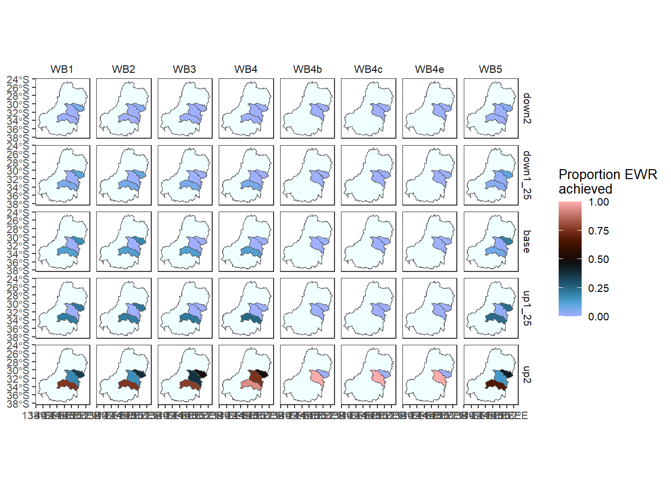
A minimal map can be created with gauges as the focal spatial unit, e.g. before any spatial aggregation has occurred.
agged_data$env_obj |> # for readability
    dplyr::filter(env_obj == 'NF1') |> # Need to reduce dimensionality
    plot_outcomes(y_col = 'ewr_achieved',
                  y_lab = 'All Arithmetic Mean',
                          x_col = 'map',
                          colorgroups = NULL,
                          colorset = 'ewr_achieved',
                          pal_list = list('scico::berlin'),
                          facet_col = 'scenario',
                          facet_row = 'env_obj',
                          scene_pal = scene_pal,
                          sceneorder = sceneorder,
                  scenariofilter = scenario_subset,
                          underlay_list = list(underlay = 'basin',
                                               underlay_pal = 'azure')) +
    ggplot2::theme(legend.position = 'bottom')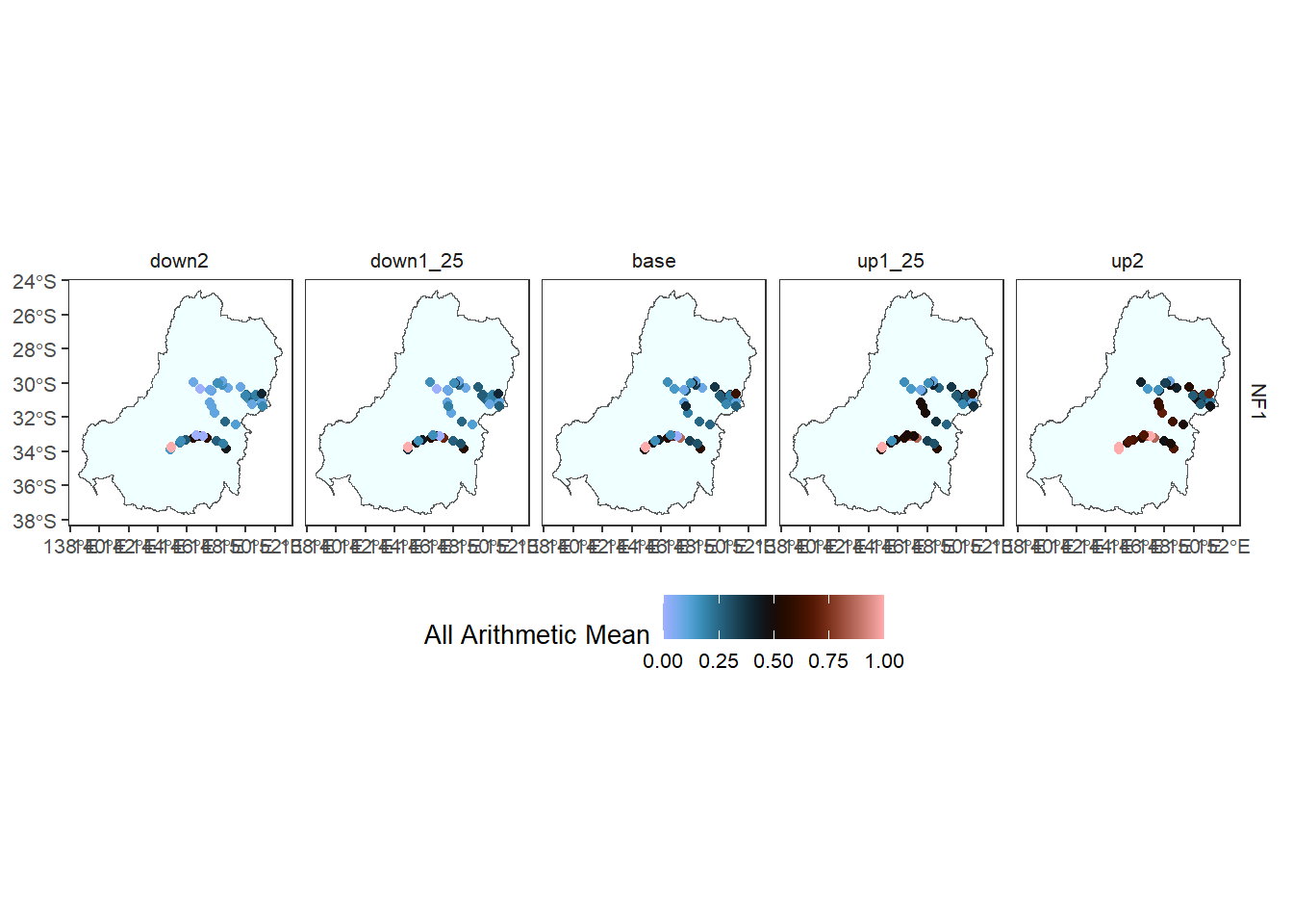
While we can’t have informative fill in multiple layers, we can have informative fill in polygons underlying point (gauge) data. Here, we include a fill in the underlay for SDL unit name (e.g. not a data fill, but still informative). It is hard to find palettes for the full set of catchments. The only discrete palette available that makes sense is ggsci::default_igv, and it’s pretty garish. Using a continuous palette (e.g. scico::oslo ) works fine too, but the colors aren’t very well spatially-separated. We need to come up with a default set that we like, I think. Could be as simple as an actual mapping of specific colors to catchments, a la scene_pal.
agged_data$env_obj |> # for readability
    dplyr::filter(env_obj == 'NF1') |> # Need to reduce dimensionality
    plot_outcomes(y_col = 'ewr_achieved',
                  y_lab = 'All arithmetic mean',
                          x_col = 'map',
                          colorgroups = NULL,
                          colorset = 'ewr_achieved',
                          pal_list = list('scico::berlin'),
                          facet_col = 'scenario',
                          facet_row = 'env_obj',
                          scene_pal = scene_pal,
                          sceneorder = sceneorder,
                  scenariofilter = scenario_subset,
                          underlay_list = list(underlay = sdl_units,
                                               underlay_ycol = 'SWSDLName',
                                               underlay_pal = 'ggsci::default_igv')) +
    ggplot2::theme(legend.position = 'bottom')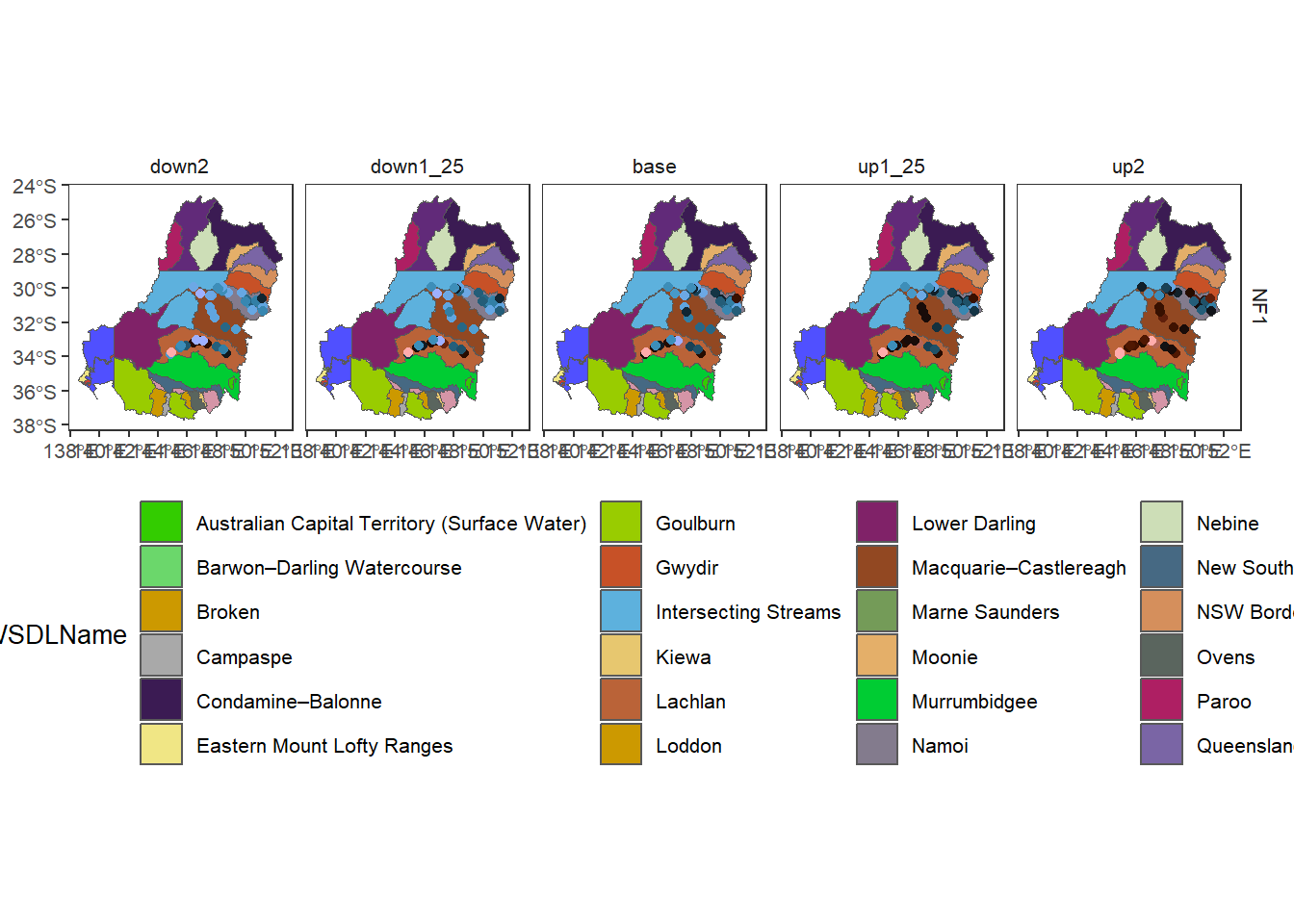
We can use a continuous variable on the underlay fill, but have to be careful to choose palettes that don’t mask each other. We can also have multiple levels of underlay polygons (e.g. if we want the basin under sdl units). Note that we can pass colors directly, and not necessarily as a palette.
agged_data$env_obj |> # for readability
  dplyr::filter(env_obj == 'NF1') |> # Need to reduce dimensionality
  plot_outcomes(y_col = 'ewr_achieved',
                x_col = 'map',
                colorgroups = NULL,
                colorset = 'ewr_achieved',
                pal_list = list('ggthemes::Orange-Gold'),
                facet_col = 'scenario',
                facet_row = 'env_obj',
                scene_pal = scene_pal,
                sceneorder = sceneorder,
                scenariofilter = scenario_subset,
                underlay_list = list(list(underlay = 'basin',
                                          underlay_pal = 'cornsilk'),
                                     list(underlay = dplyr::filter(obj_sdl_to_plot, env_obj == 'NF1'),
                                          underlay_ycol = 'ewr_achieved',
                                          underlay_pal = 'scico::oslo'))) +
  ggplot2::theme(legend.position = 'bottom')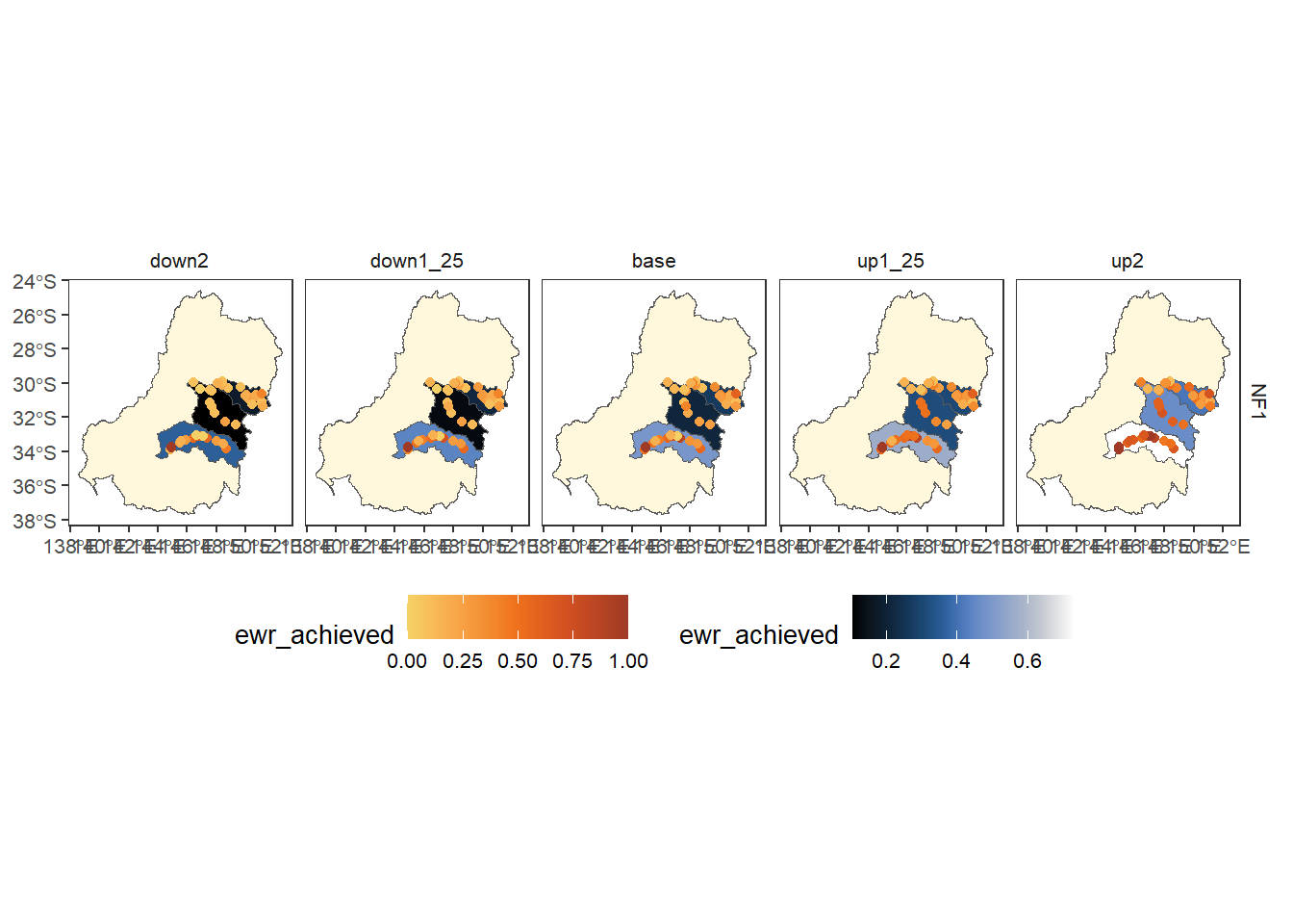
We can also overlay, here with the sdl layer as ‘primary’, here with a single color to show where gauges are.
obj_sdl_to_plot |>
    dplyr::filter(env_obj == 'NF1') |> # Need to reduce dimensionality
    plot_outcomes(y_col = 'ewr_achieved',
                          x_col = 'map',
                          colorgroups = NULL,
                          colorset = 'ewr_achieved',
                          pal_list = list('scico::berlin'),
                          facet_col = 'scenario',
                          facet_row = 'env_obj',
                          scene_pal = scene_pal,
                          sceneorder = sceneorder,
                scenariofilter = scenario_subset,
                          underlay_list = 'basin',
                          overlay_list = list(overlay = 'bom_basin_gauges',
                                              overlay_pal = 'grey40',
                                              clip = TRUE)) +
    ggplot2::theme(legend.position = 'bottom')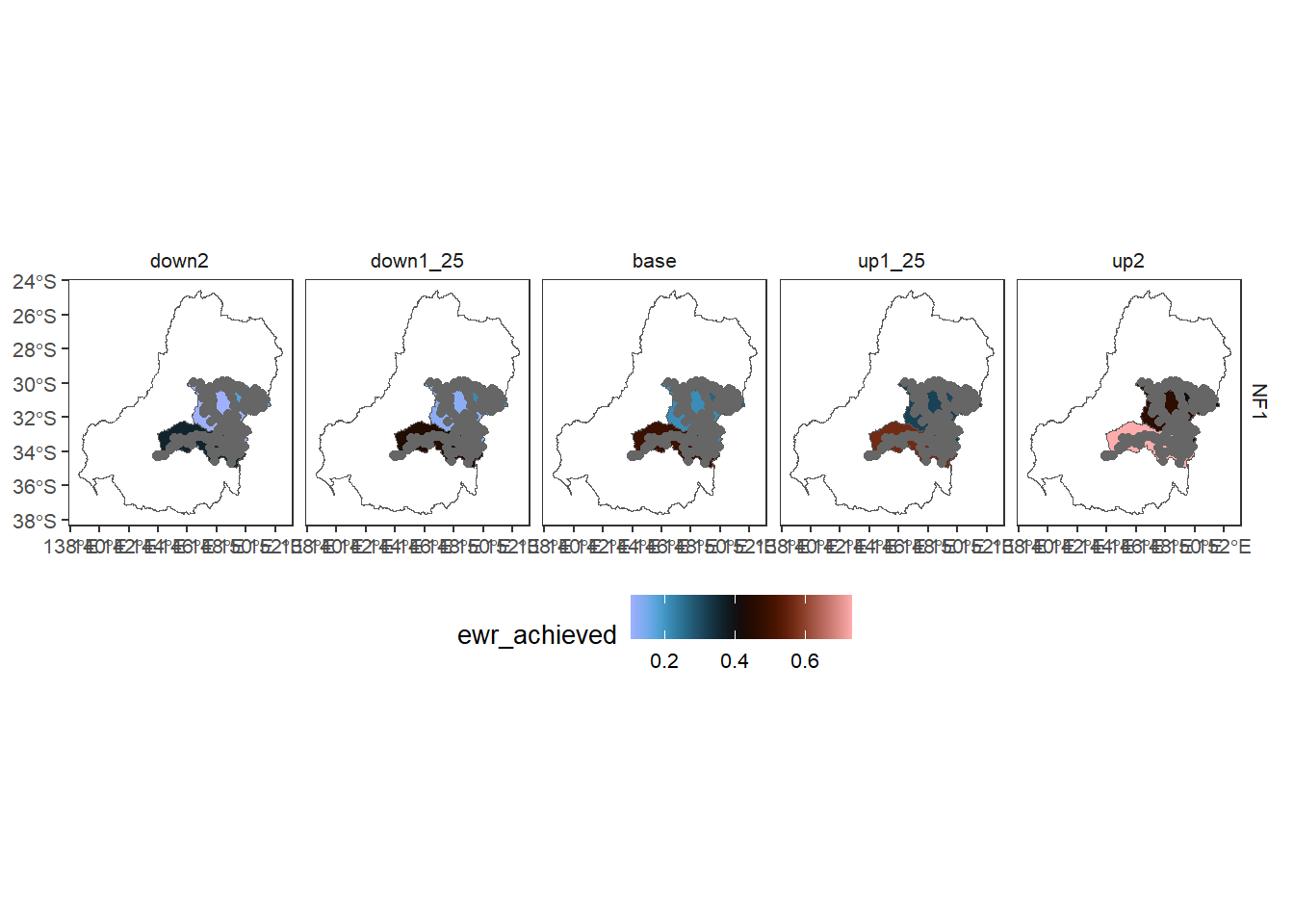
We can also give the overlay informative colors- this outcome is similar to what we’ve done above, but the amount of control we have over scaling etc differs depending on whether a layer is ‘primary’. I intend to make this more general, but will need to be careful.
obj_sdl_to_plot |>
  dplyr::filter(env_obj == 'NF1') |> # Need to reduce dimensionality
  plot_outcomes(y_col = 'ewr_achieved',
                x_col = 'map',
                colorgroups = NULL,
                colorset = 'ewr_achieved',
                pal_list = list('scico::berlin'),
                facet_col = 'scenario',
                facet_row = 'env_obj',
                scene_pal = scene_pal,
                sceneorder = sceneorder,
                scenariofilter = scenario_subset,
                underlay_list = 'basin',
                overlay_list = list(overlay = dplyr::filter(agged_data$env_obj, env_obj == 'NF1'),
                                    overlay_pal = 'scico::oslo',
                                    overlay_ycol = 'ewr_achieved',
                                    clip = TRUE)) +
  ggplot2::theme(legend.position = 'bottom')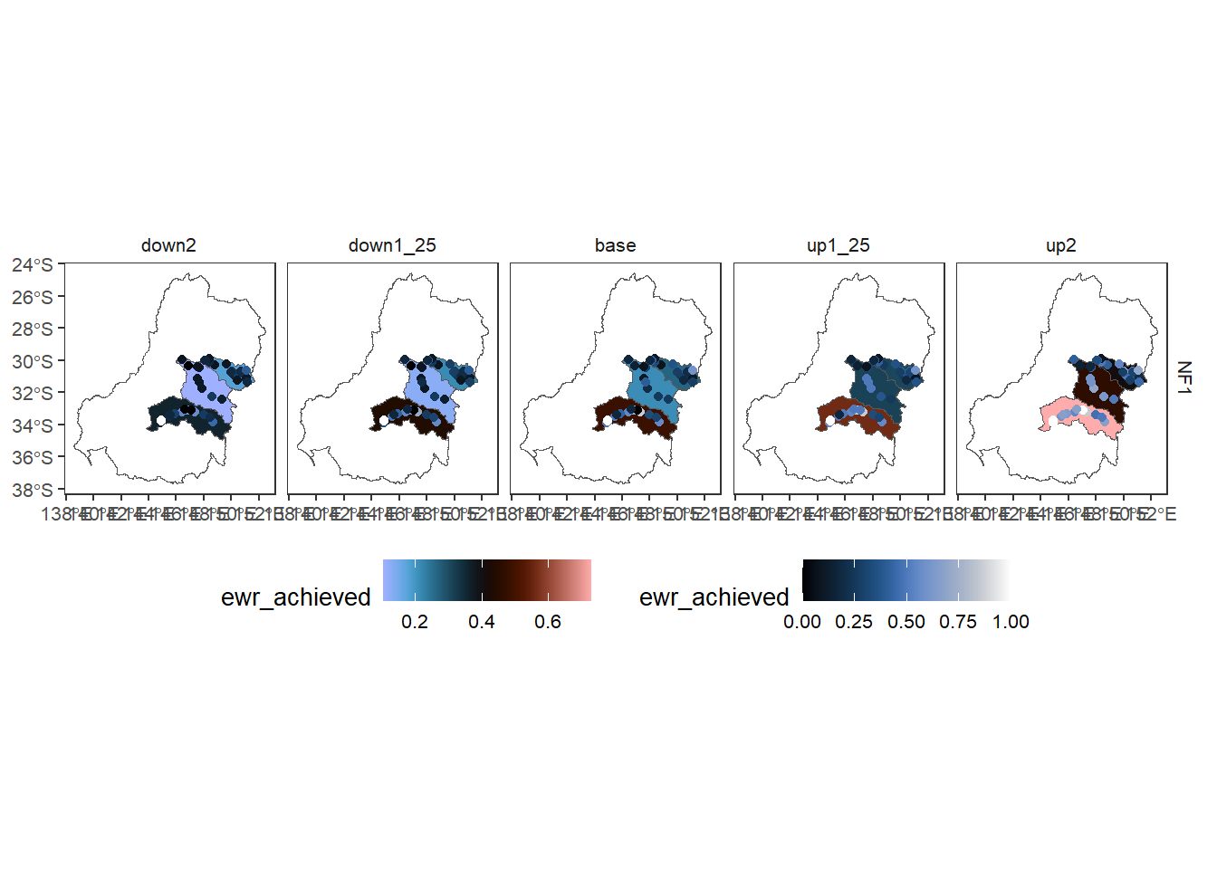
Here, we have a primary layer at the basin scale, overlay the sdl units with empty fill, and then put gauges on with informative values. There’s clearly a lot we can do here with the layering, most of which has been tested, but isn’t particularly interesting for a demonstration without a particular goal in mind.
agged_data$mdb |>
  dplyr::filter(Objective %in% c("Maintain water-dependent species richness",
                                 "Increase opportunities for colonial waterbird breeding*",
                                 "Support instream & floodplain productivity")) |> # Need to reduce dimensionality
  plot_outcomes(y_col = 'ewr_achieved',
                x_col = 'map',
                colorgroups = NULL,
                colorset = 'ewr_achieved',
                pal_list = list('scico::oslo'),
                facet_col = 'scenario',
                facet_row = 'Objective',
                scene_pal = scene_pal,
                sceneorder = sceneorder,
                scenariofilter = scenario_subset,
                overlay_list = list(list(overlay = 'sdl_units', overlay_pal = 'black'),
                                    list(overlay = dplyr::filter(agged_data$env_obj, env_obj == 'NF1'),
                                         overlay_pal = 'ggthemes::Orange-Gold',
                                         overlay_ycol = 'ewr_achieved')))+
  ggplot2::theme(legend.position = 'bottom')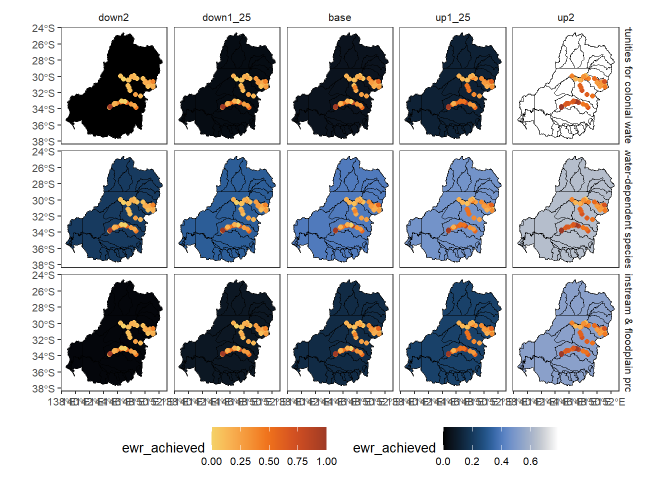
As with the other plotting functions, we can compare to baseline using arbitrary functions, here difference to get the arithmetic change in outcomes. In both cases, the scale is fixed to be centered on the reference value (0 for difference, 1 for relative), and so using a diverging palette will make that centering clear.
obj_sdl_to_plot |>
    dplyr::filter(env_group == 'WB') |> # Need to reduce dimensionality
    plot_outcomes(y_col = 'ewr_achieved',
                          x_col = 'map',
                          colorgroups = NULL,
                          colorset = 'ewr_achieved',
                          pal_list = list('ggthemes::Orange-Blue-White Diverging'),
                          facet_col = 'env_obj',
                          facet_row = 'scenario',
                          scene_pal = scene_pal,
                          sceneorder = sceneorder,
                scenariofilter = scenario_subset,
                          base_lev = 'base',
                          comp_fun = 'difference',
                          group_cols = c('env_obj', 'polyID'), # Do I need to group_by polyID for the maps? Yes. should probably automate that.
                          underlay_list = list(underlay = basin, underlay_pal = 'azure'))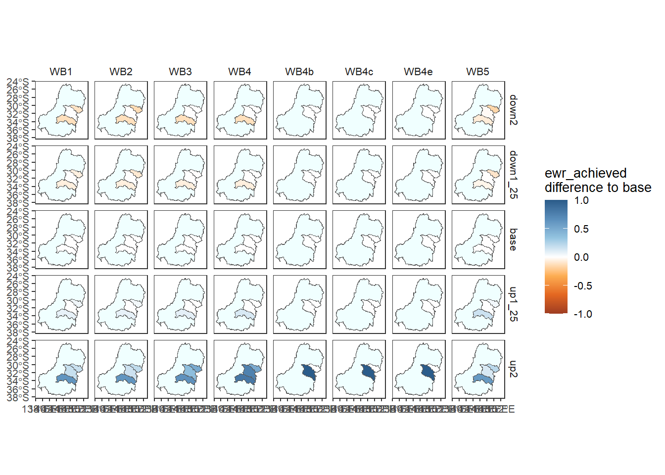
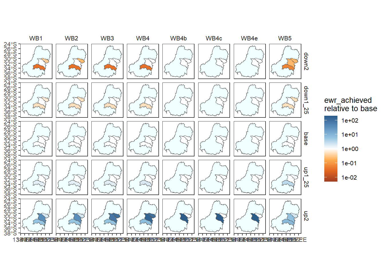
And the relative change is likely to be the most informative and appropriate in many cases. We use the add_eps argument to add a small amount (half the minimum value) to zeros, otherwise we end up taking the log of 0.
obj_sdl_to_plot |>
    dplyr::filter(env_group == 'WB') |> # Need to reduce dimensionality
    plot_outcomes(y_col = 'ewr_achieved',
                          x_col = 'map',
                          colorgroups = NULL,
                          colorset = 'ewr_achieved',
                          pal_list = list('ggthemes::Orange-Blue-White Diverging'),
                          facet_col = 'env_obj',
                          facet_row = 'scenario',
                          scene_pal = scene_pal,
                          sceneorder = sceneorder,
                scenariofilter = scenario_subset,
                          base_lev = 'base',
                          comp_fun = 'relative',
                  add_eps = min(obj_sdl_to_plot$ewr_achieved[obj_sdl_to_plot$ewr_achieved > 0],
                              na.rm = TRUE)/2,
                          zero_adjust = 'auto',
                          transy = 'log10',
                          group_cols = c('env_obj', 'polyID'), # Do I need to group_by polyID for the maps? Yes. should probably automate that.
                          underlay_list = list(underlay = basin, underlay_pal = 'azure'))