library(werptoolkitr)
library(ggplot2)
library(dplyr)
library(sf)Line plots (quantitative x)
Overview
This notebook provides examples of creating line plots, e.g. plots with one quantitative y-axis for outcome, and a quantitative x-axis. The x-axis is typically a quantitative representation of the scenario, e.g. a temperature increase, or for the demonstration here, the flow multiplier. This can be a very powerful analysis, as we can actually investigate numerical changes between scenarios, identifying potential nonlinearities, predictions, and interpolation.
The demonstrations here consider the simple demonstration of only three scenarios. We expect that more scenarios, which will give more values along the x-axis, will yield more powerful insights, particularly about important nonlinearities in the responses such as thresholds.
These plots also have the ability to use color and different color palettes to include additional information, including spatial unit and type of response. These settings are dealt with more completely in the bar_plots, with much of the mechanics the same for lines, e.g. the use of colorgroups and a list for pal_list.
For a qualitative x-axis, we would typically use line plots.
Demonstration setup
As usual, we need paths to the data.
project_dir <- file.path('more_scenarios')
hydro_dir = file.path(project_dir, 'hydrographs')
agg_dir <- file.path(project_dir, 'aggregator_output')
Scenario information
Get scenario metadata. This will be auto-found later, but leaving here until it firms up.
scenarios <- jsonlite::read_json(file.path(hydro_dir,
                                           'scenario_metadata.json')) |>
  tibble::as_tibble() |>
  tidyr::unnest(cols = everything())
Subset for demo
We have a lot of hydrographs, so for this demonstration, we will often use a subset.
gauges_to_plot <- c('412002', '419001', '422028', '421001')Standard scenario appearance
We want to have a consistent look for the scenarios across the project, with a logical ordering and standard colors. In future, this will potentially be able to be parsed from metadata, but at present we will define these properties manually. They are not included in the {werptoolkitr} package because they are project/analysis- specific.
sceneorder <- forcats::fct_reorder(scenarios$scenario_name, scenarios$flow_multiplier)
scene_pal <- make_pal(unique(scenarios$scenario_name),
                      palette = 'ggsci::nrc_npg',
                      refvals = 'base', refcols = 'black')
Choosing example data
First, we read in the aggregated data. There is example data provided by the toolkit (agg_theme_space and agg_theme_space_colsequence), but to continue with the demonstration, we will use the aggregations created here in the interleaved aggregation notebook.
Note- to readRDS sf objects, we need to have sf loaded.
agged_data <- readRDS(file.path(agg_dir, 'summary_aggregated.rds'))That has all the steps in the aggregation, so we’ll choose one (agged_data$sdl_units) at the SDL unit scale and env_obj theme scale, as this provides the opportunity to consider issues that arise from plottng multiple spatial units and grouped outcome levels. The same ideas would hold at any of the other levels in the aggregation.
To make these examples more easily, we create a slightly modified dataframe here, but this isn’t really necessary- small data manipulations are easily piped in to plot_outcomes. The SDL units data is joined to the scenarios dataframe to include the information there about the quantitative meaning of the scenarios, and is given a grouping column that puts the many env_obj variables in groups defined by their first two letters, e.g. EF for Ecosystem Function, which is then used for grouped color palettes.
If we had used multiple aggregation functions at any step, we should filter down to the one we want here, but we only used one for this example.
# Create a grouping variable
obj_sdl_to_plot <- agged_data$sdl_units |>
  left_join(scenarios, by = c('scenario' = 'scenario_name')) |>
  dplyr::mutate(env_group = stringr::str_extract(env_obj, '^[A-Z]+')) |>
  dplyr::filter(!is.na(env_group)) |>
  dplyr::arrange(env_group, env_obj)
Make line plots
We make two sorts of line plots- either straight lines through all the data points, which shows exactly what the results are, and ‘smoothed’ lines, which are fit to the data in some way to summarise a group of outputs. These can yield smoothed curves, but can also be linear regressions or other fits available from ggplot2::geom_smooth. These smooths tend to be dangerous (they inherently hide data and are a form of summary), but can also be very powerful and cleaner visualizations if used appropriately.
Lines through all data
A simple plot would be to look at all the outcomes, separated by color. We’ve given the scenarios different shapes, but that’s not really necessary- they are different along x. Even this simple plot is quite infomative- we can see that the env_obj outcomes are differently sensitive to both decreases and increases in flow, and that this differs across space.
 sdl_line <- obj_sdl_to_plot |>
    plot_outcomes(y_col = 'ewr_achieved',
                          x_col = 'flow_multiplier',
                          colorgroups = NULL,
                          colorset = 'env_obj',
                          pal_list = list('scico::berlin'),
                          facet_row = 'SWSDLName',
                          facet_col = '.',
                          scene_pal = scene_pal,
                          sceneorder = sceneorder)

 sdl_line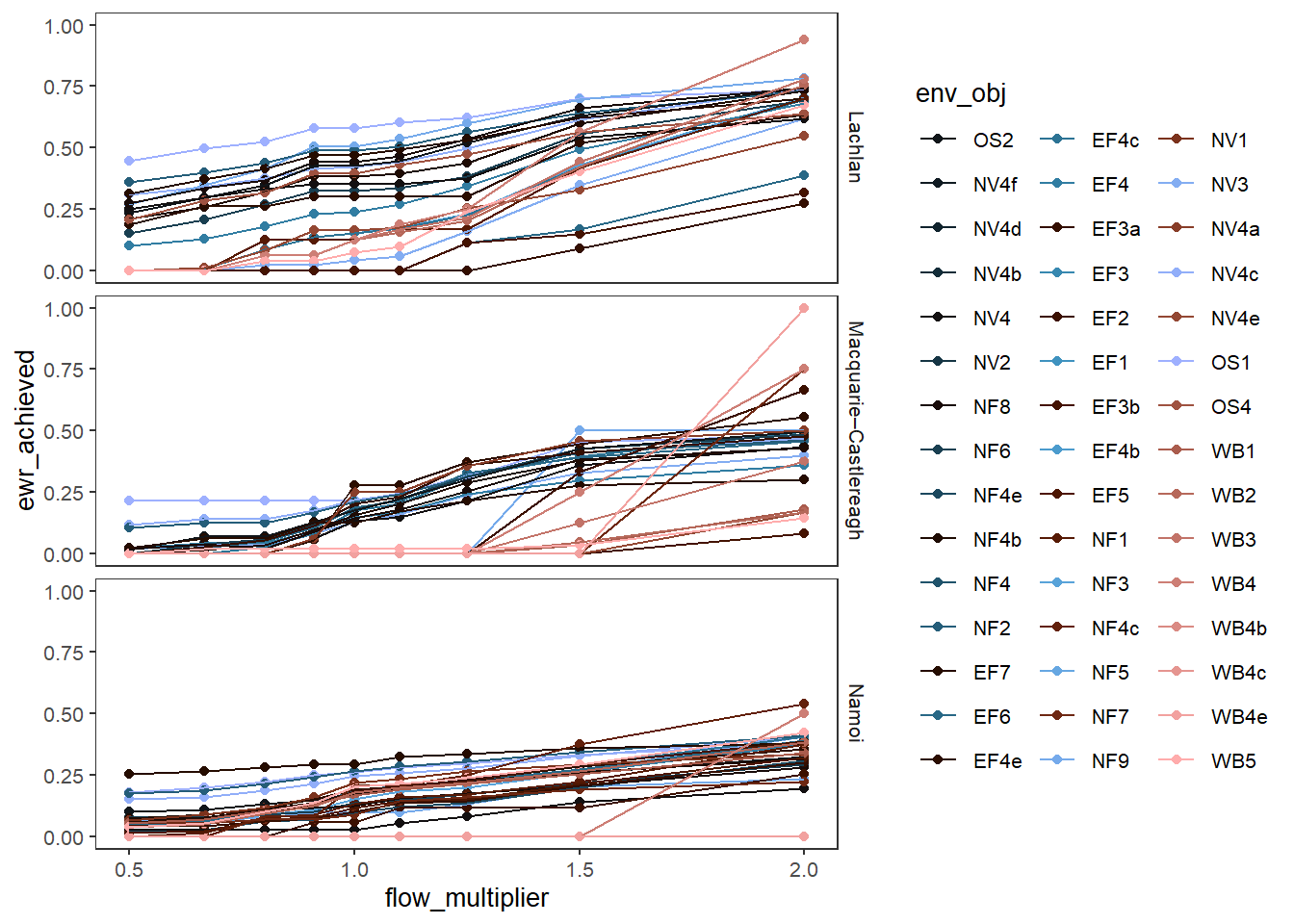
We might not care so much about individual outcomes, but about their groupings, and we can plot those in color by changing colorset = 'env_group'. We need to use point_group here to separate out the points for each env_obj.
This plot also demonstrates the use of some additional arguments. We’re also using transx to log the x-axis, which is particularly appropriate for the multiplicative flow scaling in this demonstration. We also log the y-axis with transy since we’re using a comp_fun (relative) to look at the multiplicative shift in each env_obj to baseline. We’re using various *_lab arguments to adjust the labelling. We also need to use the (poorly documented) group_cols argument to specify unique rows. This is historical and only applies to baselining the data. It will be auto-found in a future update.
Scientifically, one important thing to note here is that the range on y (0-10) is much greater than the range on x (0.3 - 3), and so (unsurprisingly), some outcomes are disproportionately impacted by flow. Other outcome values are less than the relative shift in flow, and so there are others that are disproportionately insensitive. These disproportionate responses also depend on whether flows decrease or increase- they are not symmetric.
sdl_line_options <- obj_sdl_to_plot |>
  plot_outcomes(y_col = 'ewr_achieved',
                x_col = 'flow_multiplier',
                y_lab = 'Proportion met',
                x_lab = 'Change in flow',
                transx = 'log10',
                transy = 'log10',
                color_lab = 'Environmental\ngroup',
                colorset = 'env_group',
                pal_list = list('scico::berlin'),
                point_group = 'env_obj',
                facet_row = 'SWSDLName',
                facet_col = '.',
                scene_pal = scene_pal,
                sceneorder = sceneorder,
                base_lev = 'base',
                comp_fun = 'relative',
                group_cols = c('env_obj', 'polyID'))

sdl_line_options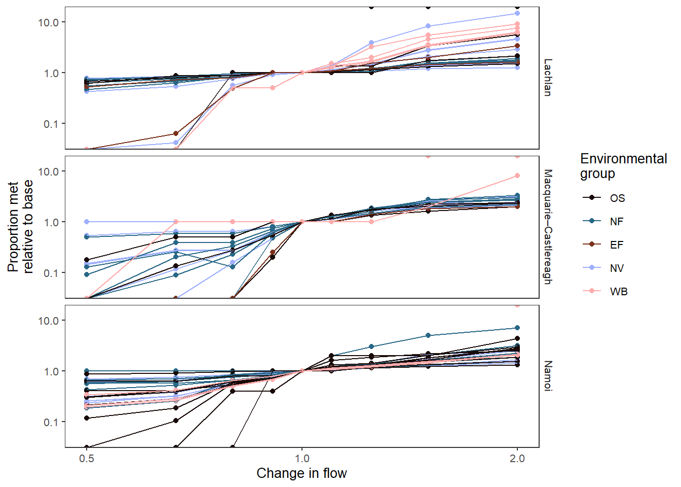
We can also give the groups different palettes, as demonstrated more completely in the bar plots and causal networks. Now, we don’t need point_group anymore, since the colors are assigned to the unique env_objs.
# Create a palette list
grouplist = list(EF = 'grDevices::Purp',
                 NF = 'grDevices::Mint',
                 NV = 'grDevices::Burg',
                 OS = 'grDevices::Blues',
                 WB = 'grDevices::Peach')

sdl_line_groups <- obj_sdl_to_plot |>
  plot_outcomes(y_col = 'ewr_achieved',
                x_col = 'flow_multiplier',
                y_lab = 'Proportion met',
                x_lab = 'Change in flow',
                transx = 'log10',
                transy = 'log10',
                color_lab = 'Environmental\ngroup',
                colorgroup = 'env_group',
                colorset = 'env_obj',
                pal_list = grouplist,
                facet_row = 'SWSDLName',
                facet_col = '.',
                scene_pal = scene_pal,
                sceneorder = sceneorder,
                base_lev = 'base',
                comp_fun = 'relative',
                group_cols = c('env_obj', 'polyID'))

sdl_line_groups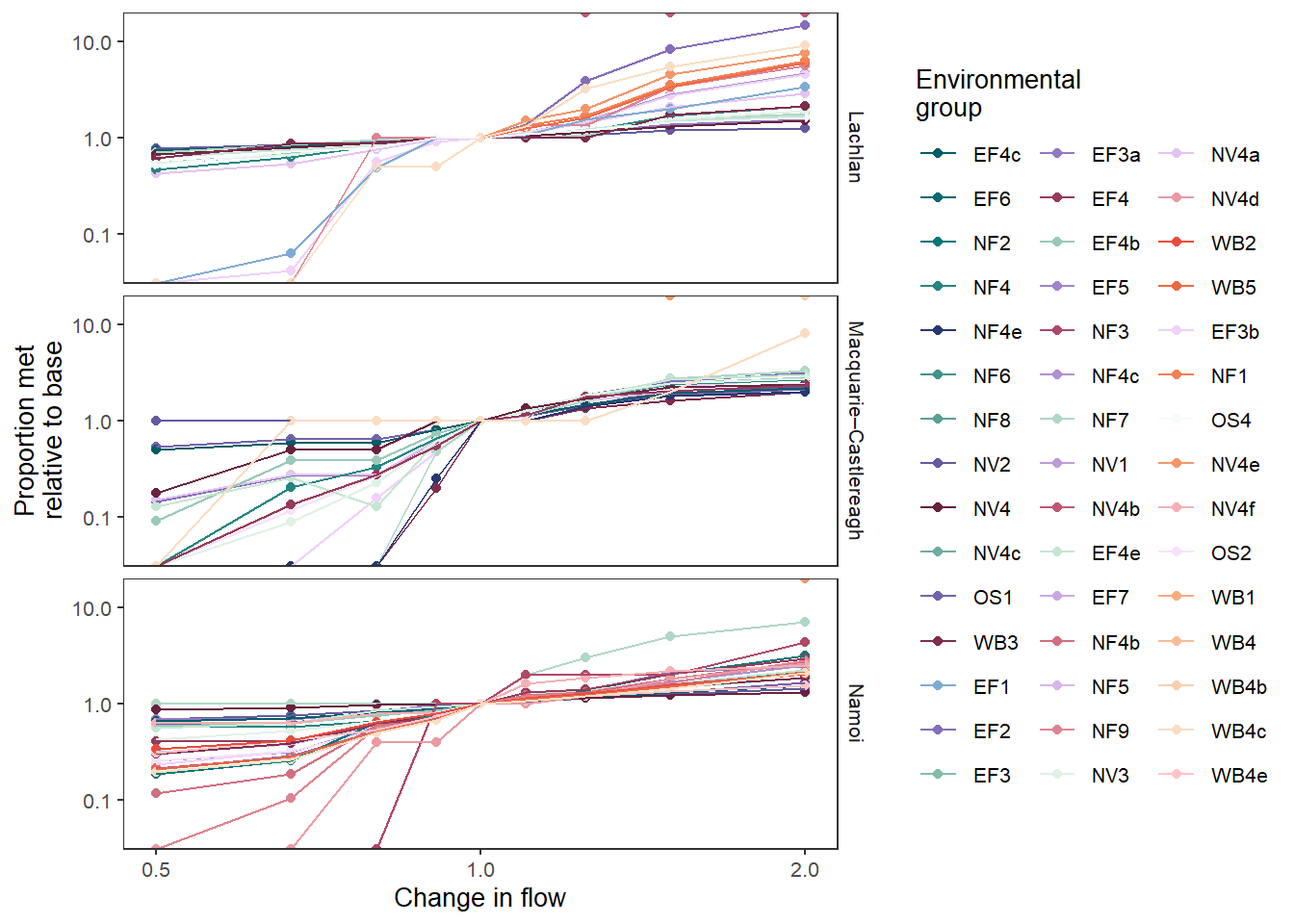
That’s fairly complex, so we can facet it, as we did with the bars to make the individual env_objs easier to see.
sdl_line_groups_facet <- obj_sdl_to_plot |>
  plot_outcomes(y_col = 'ewr_achieved',
                x_col = 'flow_multiplier',
                y_lab = 'Proportion met',
                x_lab = 'Change in flow',
                transx = 'log10',
                transy = 'log10',
                color_lab = 'Environmental\ngroup',
                colorgroup = 'env_group',
                colorset = 'env_obj',
                pal_list = grouplist,
                facet_row = 'SWSDLName',
                facet_col = 'env_group',
                scene_pal = scene_pal,
                sceneorder = sceneorder,
                base_lev = 'base',
                comp_fun = 'relative',
                group_cols = c('env_obj', 'polyID'))

sdl_line_groups_facet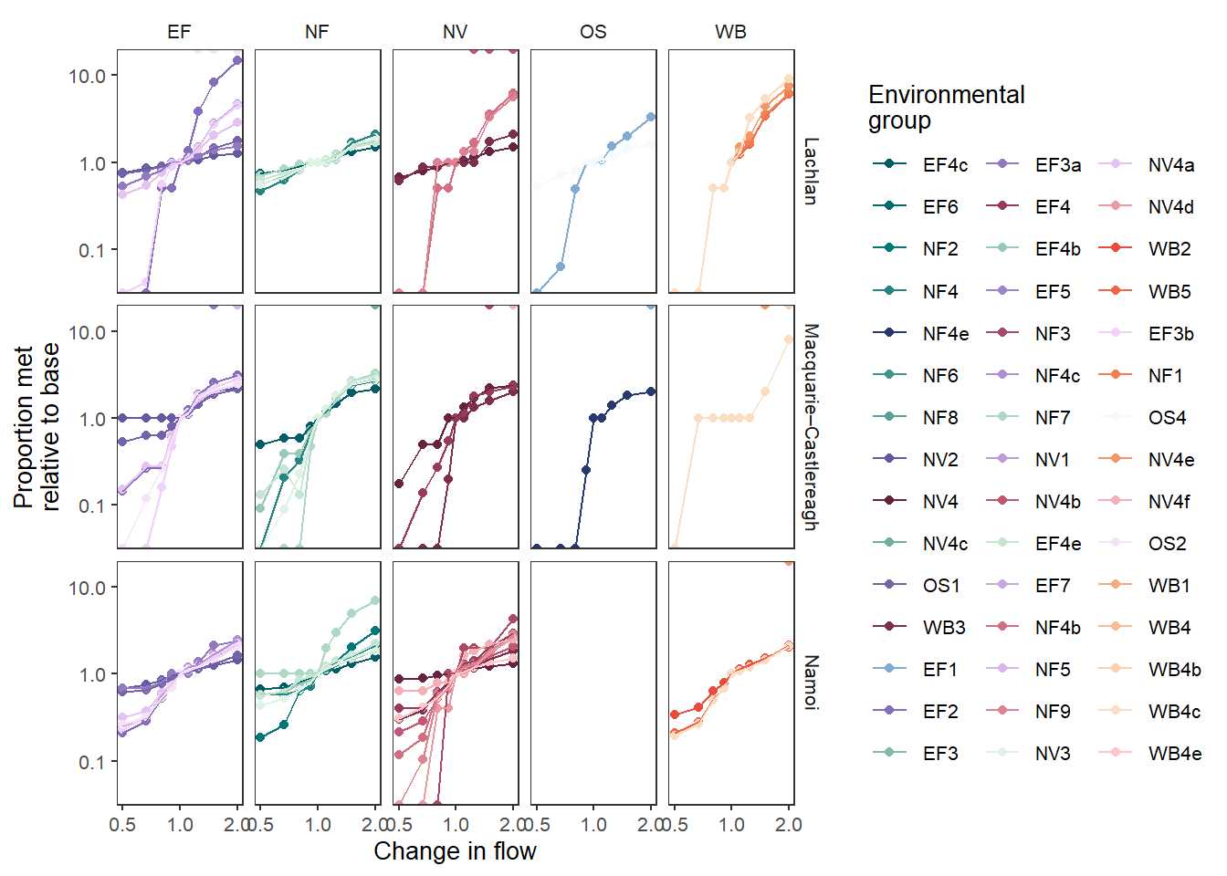
The above is typically how we would go about this facetting, but it is worth reiterating that these are just ggplots, and so we can post-hoc add facetting. Using the version with only spatial facetting ( Figure 1 ), we can add the env_group facet on, matching Figure 2 . Note that we re-build all the facets here, due to the specification of ggplot2::facet_grid.
sdl_line_groups + facet_grid(SWSDLName ~ env_group)
As with the bar plots, we can color by any column we want, and the spatial units is a logical choice. We again use point_group, since multiple env_obj rows are mapped to each color. The overplotting gets unreadable here and so I’ve retained the facetting, but if we were looking at a subset, the line colors could be enough (or if we are summarising the data with a smoother- see below).
sdl_line_sdl <- obj_sdl_to_plot |>
  filter(env_group == 'EF') |>
  plot_outcomes(y_col = 'ewr_achieved',
                x_col = 'flow_multiplier',
                y_lab = 'Proportion met',
                x_lab = 'Change in flow',
                transx = 'log10',
                transy = 'log10',
                color_lab = 'SDL unit',
                colorset = 'SWSDLName',
                pal_list = list("ggsci::default_jama"),
                point_group = 'env_obj',
                scene_pal = scene_pal,
                sceneorder = sceneorder,
                base_lev = 'base',
                comp_fun = 'relative',
                group_cols = c('env_obj', 'polyID'))

sdl_line_sdl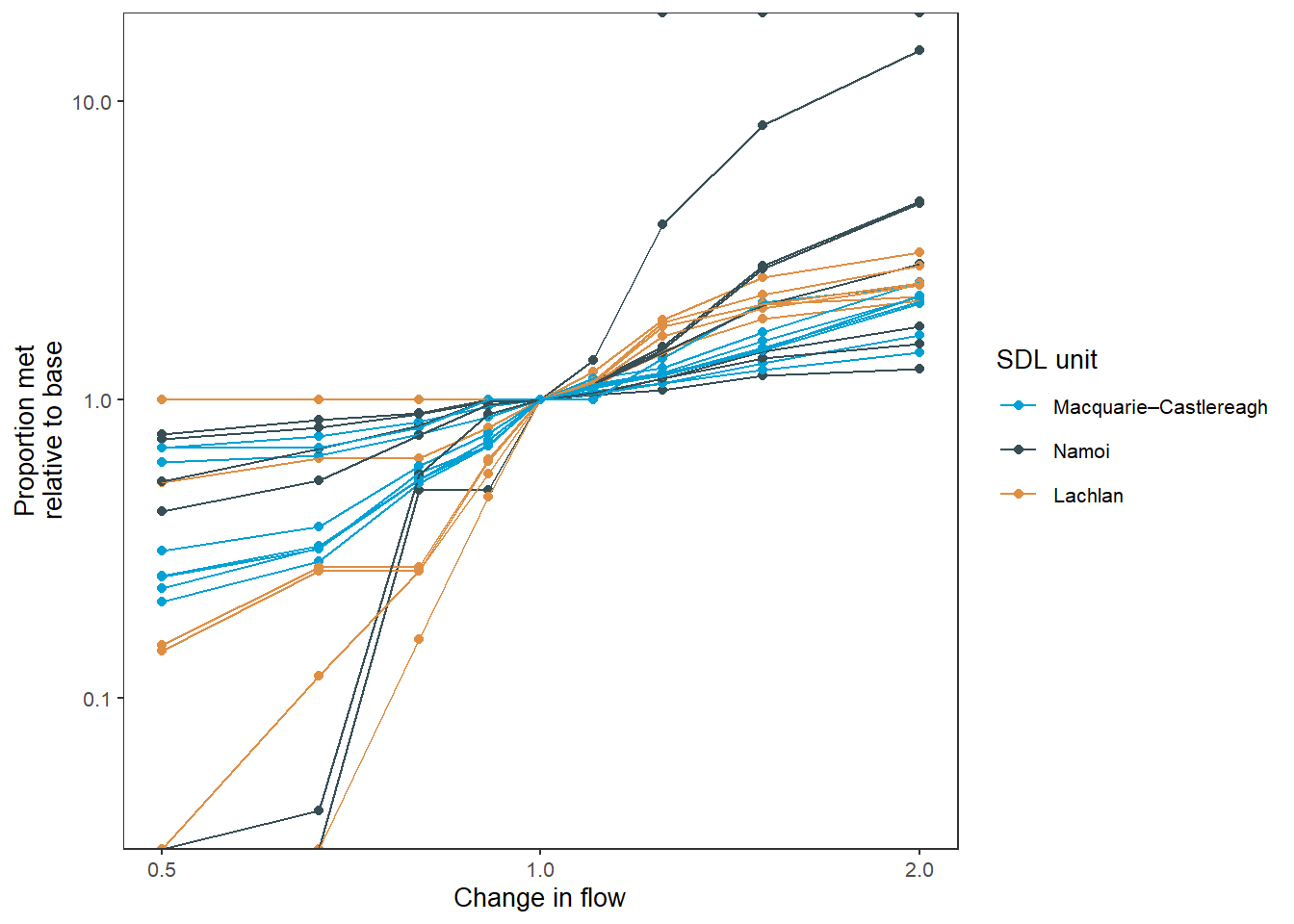
env_obj.Smoothing (fit lines)
We can use smoothing to fit lines through multiple points, e.g. if we want to group data in some way- maybe use it to put a line through the color groups and ignore individual levels. This is dangerous- it’s an aggregation. But it can also be very informative, and we can show the individual data points to avoid misleading information. We demonstrate here using them to illustrate unique outcomes, as well as more typical uses as lines of best fit that aggregate over a number of outcomes.
To get smoothed lines, we use smooth = TRUE. By default, that produces a loess fit (as with ggplot2::geom_smooth, but we can also pass smooth_method, which is the method argument to ggplot::geom_smooth, and so allows things like lm and glm fits.
Unique points
Fitting lines through unique points at each scenario level is a bit contrived, but it can be useful if we want to accentuate nonlinear relationships. Linear fits are possible too, though these are typically less useful.
With unique points, this just fits a single curved line through each env_obj. Recapitulating the above, we color here from SDL unit.
  sdl_smooth_sdl <- obj_sdl_to_plot |>
    plot_outcomes(y_col = 'ewr_achieved',
                          x_col = 'flow_multiplier',
                          y_lab = 'Proportion met',
                          x_lab = 'Change in flow',
                          transx = 'log10',
                          color_lab = 'Catchment',
                          colorgroups = NULL,
                          colorset = 'SWSDLName',
                          point_group = 'env_obj',
                          pal_list = list('ggsci::default_jama'),
                          facet_row = 'env_group',
                          facet_col = '.',
                          scene_pal = scene_pal,
                          sceneorder = sceneorder,
                          base_lev = 'base',
                          comp_fun = 'difference',
                          group_cols = c('env_obj', 'polyID'),
                          smooth = TRUE)

  suppressWarnings(print(sdl_smooth_sdl))
And we can do the same for environmental groupings.
  sdl_smooth_groups <- obj_sdl_to_plot |>
    plot_outcomes(y_col = 'ewr_achieved',
                          x_col = 'flow_multiplier',
                          y_lab = 'Proportion met',
                          x_lab = 'Change in flow',
                          transx = 'log10',
                          color_lab = 'Environmental grouping',
                          colorgroups = NULL,
                          colorset = 'env_group',
                          point_group = 'env_obj',
                          pal_list = list('scico::berlin'),
                          facet_row = 'env_group',
                          facet_col = 'SWSDLName',
                          scene_pal = scene_pal,
                          sceneorder = sceneorder,
                          base_lev = 'base',
                          comp_fun = 'difference',
                          group_cols = c('env_obj', 'polyID'),
                          smooth = TRUE)
suppressWarnings(print(sdl_smooth_groups))
`geom_smooth()` using method = 'loess' and formula = 'y ~ x'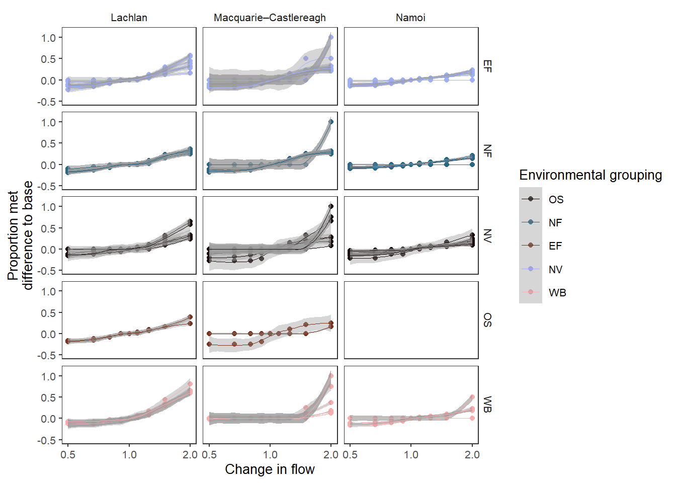
Using smooth_method = 'lm' is a linear fit. It does not recapitulate the simple lines above, however, because it fits the line through all the scenario data points, rather than simply joining them together. I have turned smooth_se = FALSE here because with unique groups the standard errors are enormous.
sdl_lm_groups <- obj_sdl_to_plot |>
    plot_outcomes(y_col = 'ewr_achieved',
                          x_col = 'flow_multiplier',
                          y_lab = 'Proportion met',
                          x_lab = 'Change in flow',
                          transx = 'log10',
                          color_lab = 'Environmental grouping',
                          colorgroups = NULL,
                          colorset = 'env_group',
                          point_group = 'env_obj',
                          pal_list = list('scico::berlin'),
                          facet_row = 'env_group',
                          facet_col = 'SWSDLName',
                          scene_pal = scene_pal,
                          sceneorder = sceneorder,
                          base_lev = 'base',
                          comp_fun = 'relative',
                          group_cols = c('env_obj', 'polyID'),
                          smooth = TRUE,
                  smooth_method = "lm", smooth_se = FALSE)
Warning: NaN and Inf introduced in `plot_prep`, likely due to division by zero.
324 values were lost.suppressWarnings(print(sdl_lm_groups))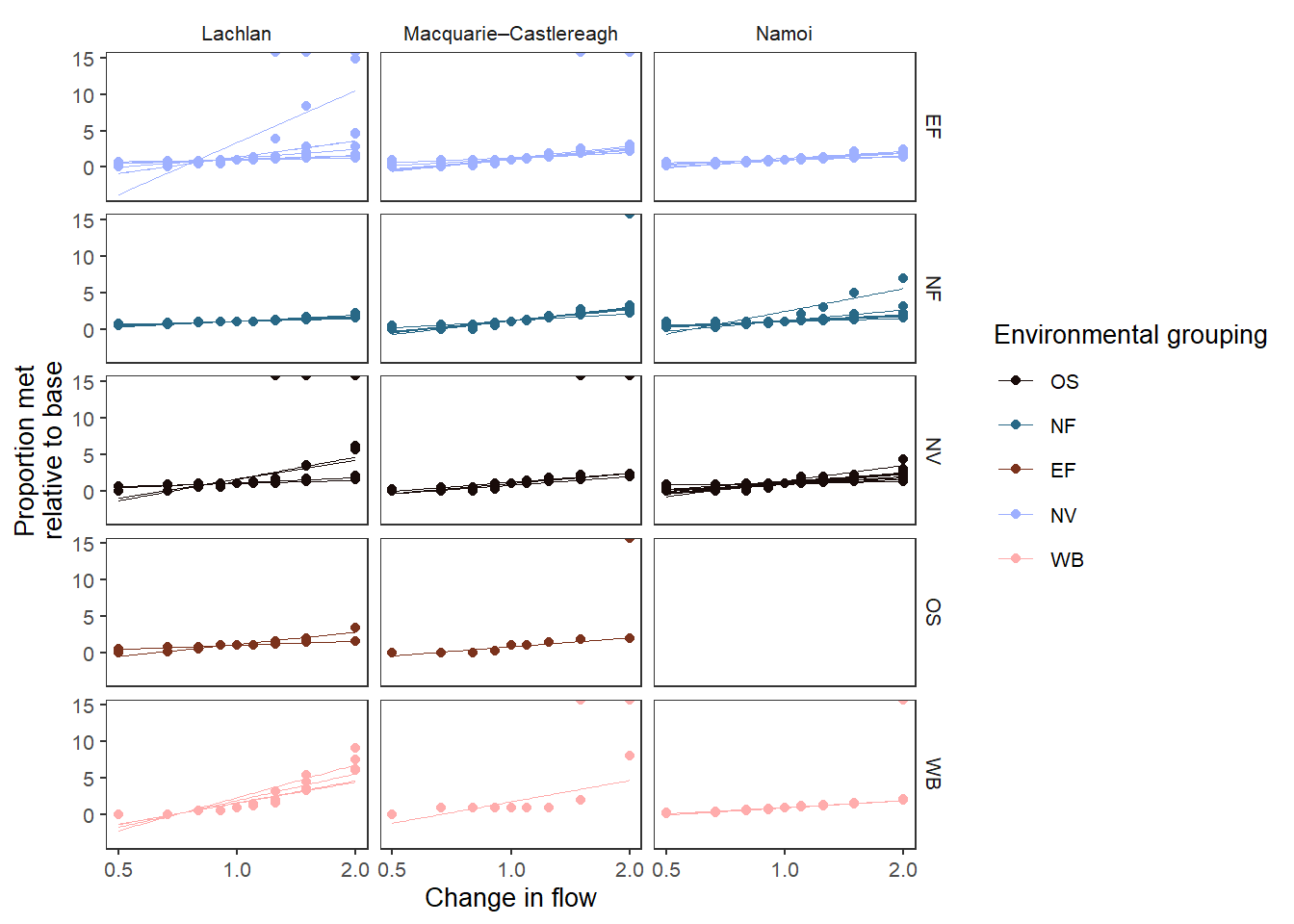
Fit multiple points
Fitting lines is most often associated with things like regression and loess smoothing, where we use it to aggregate over a number of datapoints to find the line of best fit. We can do that here, simply by not having all points accounted for across the facetting, point_group, and colorset. NOTE- group_cols should still include unique values, because group_cols determines the baselining (e.g. what gets compared), not the plot groupings.
One example would be to perform the same analysis as in Figure 3, but instead of plotting each point, fit a line to show the mean change within each SDL unit. We’ve pulled env_obj out of point_group, but left it in group_cols , because we still want each env_obj baselined with itself, not to the mean of env_group. Now, we can look at all the env_groups, because there are far fewer lines and so the overplotting isn’t an issue.
We use a small add_eps to avoid zeros and allow all data to be relativised and plotted.
sdl_fit_sdl <- obj_sdl_to_plot |>
  plot_outcomes(y_col = 'ewr_achieved',
                x_col = 'flow_multiplier',
                y_lab = 'Proportion met',
                x_lab = 'Change in flow',
                transx = 'log10',
                transy = 'log10',
                color_lab = 'SDL unit',
                colorset = 'SWSDLName',
                pal_list = list("ggsci::default_jama"),
                facet_wrapper = 'env_group',
                scene_pal = scene_pal,
                sceneorder = sceneorder,
                base_lev = 'base',
                comp_fun = 'relative',
                add_eps = min(obj_sdl_to_plot$ewr_achieved[obj_sdl_to_plot$ewr_achieved > 0],
                              na.rm = TRUE)/2,
                group_cols = c('env_obj', 'polyID'),
                smooth = TRUE)

suppressWarnings(print(sdl_fit_sdl))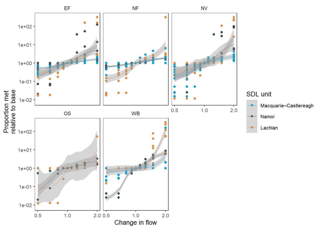
env_obj.We can make a very similar plot, looking at the environmental groups, a smooth fit of Figure 1 . We use a position argument (which passes to {ggplot2}, and so has the same syntax) to see overplotted points, and an add_eps to avoid zeros to relativise and plot all the data.
sdl_fit_groups <- obj_sdl_to_plot |>
  plot_outcomes(y_col = 'ewr_achieved',
                x_col = 'flow_multiplier',
                y_lab = 'Proportion met',
                x_lab = 'Change in flow',
                transx = 'log10',
                transy = 'log10',
                color_lab = 'Environmental\ngroup',
                colorset = 'env_group',
                pal_list = list('scico::berlin'),
                facet_row = 'SWSDLName',
                facet_col = '.',
                scene_pal = scene_pal,
                sceneorder = sceneorder,
                base_lev = 'base',
                comp_fun = 'relative',
                add_eps = min(obj_sdl_to_plot$ewr_achieved[obj_sdl_to_plot$ewr_achieved > 0],
                              na.rm = TRUE)/2,
                group_cols = c('env_obj', 'polyID'),
                smooth = TRUE,
                position = position_jitter(width = 0.01, height = 0))

sdl_fit_groups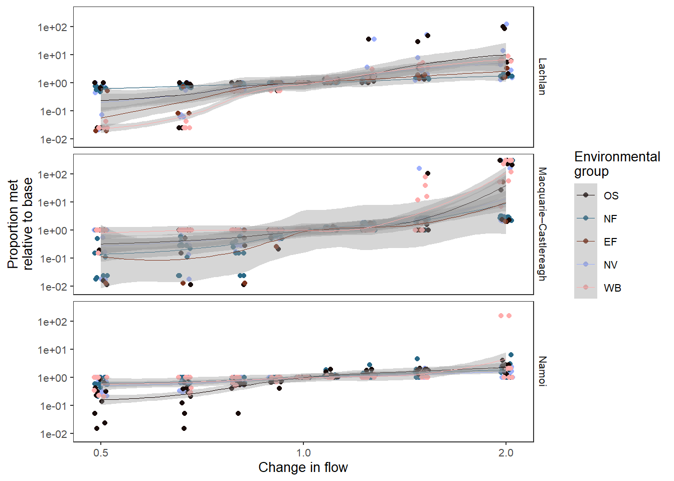
env_obj.As we saw above, we can use method = 'lm' to plot a regression, though in general we do not expect these relationships to be linear, and mathematically characterising them will be a complex task that is not the purview of plotting (though is in the purview of the Comparer, and will be addressed once we have more complete outputs).
A linear fit of the SDL units ( Figure 6 ) is one example of how this might work. It is useful to know here that deviations from a 1:1 line on logged axes as here means that the outcomes are responding disproportionately more (steeper) or less (shallower) than the underlying changes to flow.
sdl_lm_sdl <- obj_sdl_to_plot |>
  plot_outcomes(y_col = 'ewr_achieved',
                x_col = 'flow_multiplier',
                y_lab = 'Proportion met',
                x_lab = 'Change in flow',
                transx = 'log10',
                transy = 'log10',
                color_lab = 'SDL unit',
                colorset = 'SWSDLName',
                pal_list = list("ggsci::default_jama"),
                facet_wrapper = 'env_group',
                scene_pal = scene_pal,
                sceneorder = sceneorder,
                base_lev = 'base',
                comp_fun = 'relative',
                add_eps = min(obj_sdl_to_plot$ewr_achieved[obj_sdl_to_plot$ewr_achieved > 0],
                              na.rm = TRUE)/2,
                group_cols = c('env_obj', 'polyID'),
                smooth = TRUE,
                smooth_method = 'lm')

suppressWarnings(print(sdl_lm_sdl))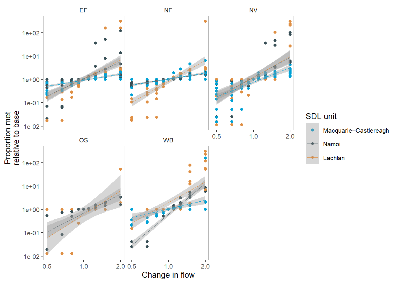
env_obj.