library(werptoolkitr)
library(ggplot2)
library(dplyr)Heatmap
Overview
This notebook provides examples of creating heatmaps to plot outcomes as colors with two driver axes (e.g. temperature and rainfall changes). At present, we only have one axis of change in both the simple 4x demonstration and the flow scaling. Once we have two axes, these heatmaps should come together quickly, including the ability to overplot points and fit kernel densities.
For a 1-d version, with variation in a single driver axis and outcomes on the y (instead of color), see the bar plots and line plots
Demonstration setup
As usual, we need paths to the data.
project_dir <- file.path('more_scenarios')
hydro_dir = file.path(project_dir, 'hydrographs')
agg_dir <- file.path(project_dir, 'aggregator_output')
Scenario information
This should be auto-acquired from the dirs above. But while its format is still up in the air, I’m leaving it a bit more user-editable.
scenarios <- jsonlite::read_json(file.path(hydro_dir,
                                           'scenario_metadata.json')) |>
  tibble::as_tibble() |>
  tidyr::unnest(cols = everything())
Subset for demo
We have a lot of hydrographs, so for this demonstration, we will often use a subset.
gauges_to_plot <- c('412002', '419001', '422028', '421001')Standard scenario appearance
We want to have a consistent look for the scenarios across the project, with a logical ordering and standard colors. In future, this will potentially be able to be parsed from metadata, but at present we will define these properties manually. They are not included in the {werptoolkitr} package because they are project/analysis- specific.
sceneorder <- forcats::fct_reorder(scenarios$scenario_name, scenarios$flow_multiplier)
scene_pal <- make_pal(unique(scenarios$scenario_name),
                      palette = 'ggsci::nrc_npg',
                      refvals = 'base', refcols = 'black')
Plot heatmaps
Once we have data that needs heatmaps, we’d read in those aggregated outcome lists and make the demo plots here.
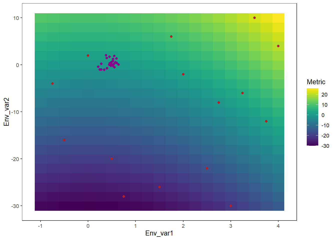
As an example
variables <- tidyr::expand_grid(Env_var1 = seq(-1, 4, 0.25), Env_var2 = seq(-30, 10, 2))
variables <- variables %>%
dplyr::mutate(Metric = Env_var1^2 + Env_var2)ggplot(variables) + geom_raster(aes(x = Env_var1, y = Env_var2, fill = Metric)) +
viridis::scale_fill_viridis()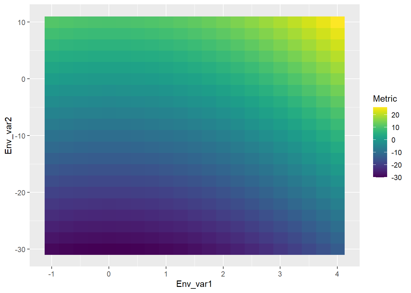
samples <- tibble(Env_var1 = sample(seq(-1, 4, 0.25), 15), Env_var2 = sample(seq(-30, 10, 2), 15), scenario = as.character(1:15), isscenario = FALSE)

scenariotib <- tibble(Env_var1 = rnorm(26, 0.5, 0.1), Env_var2 = rnorm(26, 0, 1), scenario = letters, isscenario = TRUE)

scenariosamples <- bind_rows(samples, scenariotib)
heatexample <- ggplot() +
geom_raster(data = variables,
aes(x = Env_var1, y = Env_var2, fill = Metric)) +
viridis::scale_fill_viridis() +
geom_point(data = scenariosamples,
aes(x = Env_var1, y = Env_var2, color = isscenario)) +
scale_color_manual(values = c('firebrick', 'magenta4')) +
guides(color = 'none') +
theme_werp_toolkit()
heatexample